In preparation for the Istria Infrastructure Trails walking seminar – reading the texts, talking to the participants, reviewing the topics announced – what struck me most as a designer was the huge number of intersections between design and infrastructure; both from the point of view of the user and from the point of view of academic research.
Like infrastructure, design is not yet content in itself; it is planning how to get information from point A to point B; and it is an assessment about the most appropriate way to make that transit. We use design techniques to direct people, their work or their gaze, and to anticipate who will be attracted to it and in what situation: is the printed material intended to be read with pleasure and calm while you are lying on the sofa, or to understand as quickly as possible how a defibrillator works in a complete panic?
Similar to infrastructure, design ranges from complete visibility and clarity of its role and position, to a ubiquity and mundanity that is so completely internalised from the user’s point of view that we no longer even think we are dealing with a designed object or service. A series of design processes and decisions influence the way we think and work without being conscious of it: we use the programmes on our computers that we stare at daily with an internalised automatism; without thinking we can follow signs on roads, in airports, and at the hospitals, – and last but not least – on our phones, and despite the fact that most of the time we try to, for the most part, ignore them, we accept all kinds of advertising attempts and understand who they are aimed at and in what context.
This gives rise to a problem which is again akin to the study of infrastructure: how to separate the visual communication itself from the content it communicates?
One of the main problems with the discourse on graphic design is that – although we are confronted with the results of design work every waking minute – we rarely engage with the definition, contributions and value of design. Compared to literature, architecture or anthropology, design is developed with a deficiency of theoretical reflection; without the critical substance that the humanities possess, and without the empirical analysis that the natural sciences – or, say, economics – enjoy. At the same time, design stands at the intersection of art, economy, technology and craft, and it is precisely this complexity and versatility that obscures and makes difficult the measurability of its impact.
It is this very problem of measurability that design shares with infrastructure on another level: because we operate in a social system in which we are prepared to measure value and contribution mainly – or entirely – by financial criteria, all disciplines and activities that do not produce evident monetary value run aground. It is difficult to isolate – let alone measure and evaluate – contributions that are personal, social, national – that is to say, qualitative – according to a quantitative key. How to measure symbolic value? One design product that has been so completely overshadowed by its symbolic value that it is no longer seen as design at all, but as a symbol only, is the national flag and coat of arms. Of course, most of the examples are not as extreme, but the logic remains the same.
And last but not least: design, which on reflection is not “like infrastructure”, but is infrastructure in its own way, albeit on a tiny scale, does not, of course, emerge and live in a vacuum, but in the context of society: sometimes it co-creates it, sometimes it follows its needs and tendencies – which automatically means darker, or at least unreflected, aspects.
Designers like to say that design, when done well, is the most democratic of all languages, because its central aim is to translate into a language that is as accessible, clear and understandable as possible; and the example we most like to cite is airport signs, which, because of the inherent mix of cultures and languages of users, but also because of the predictable rush and diminished alertness, is reduced to pictogram communication and a type of signage that prioritises legibility and clarity over any stylistic specificity or aesthetic intent – and as such is also the most inclusive. It is probably no coincidence, however, that the most inclusive and high-quality design example is inherent to the most exclusive means of transport.
Design is therefore not just about functionality, nor is it just about aesthetic sophistication : any visual message can connect or discriminate, relieve or inhibit, amuse or annoy; it can be more or less comprehensible, and its impact can be short- or long-term.
Having said all that, I note that I could replace every reference to design with the word “infrastructure” and the text would retain its intended meaning, so in the same spirit, here’s an addendum: in the same way that a bridge can sometimes be just a bridge, sometimes a logo – or a website – can be just a logo and a website.
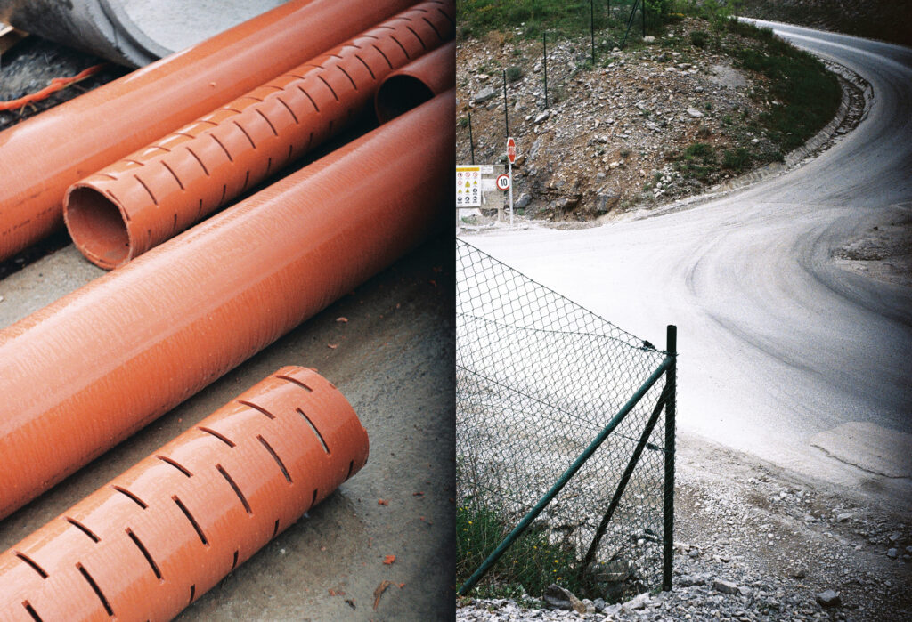
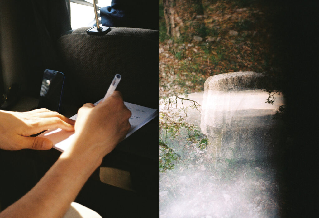
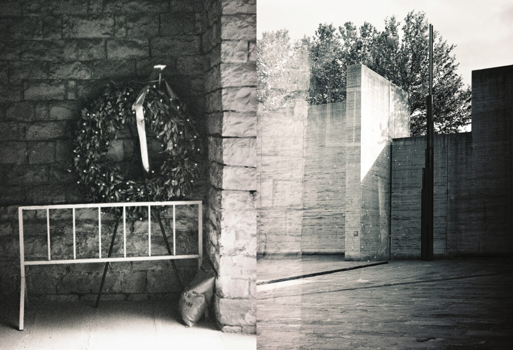
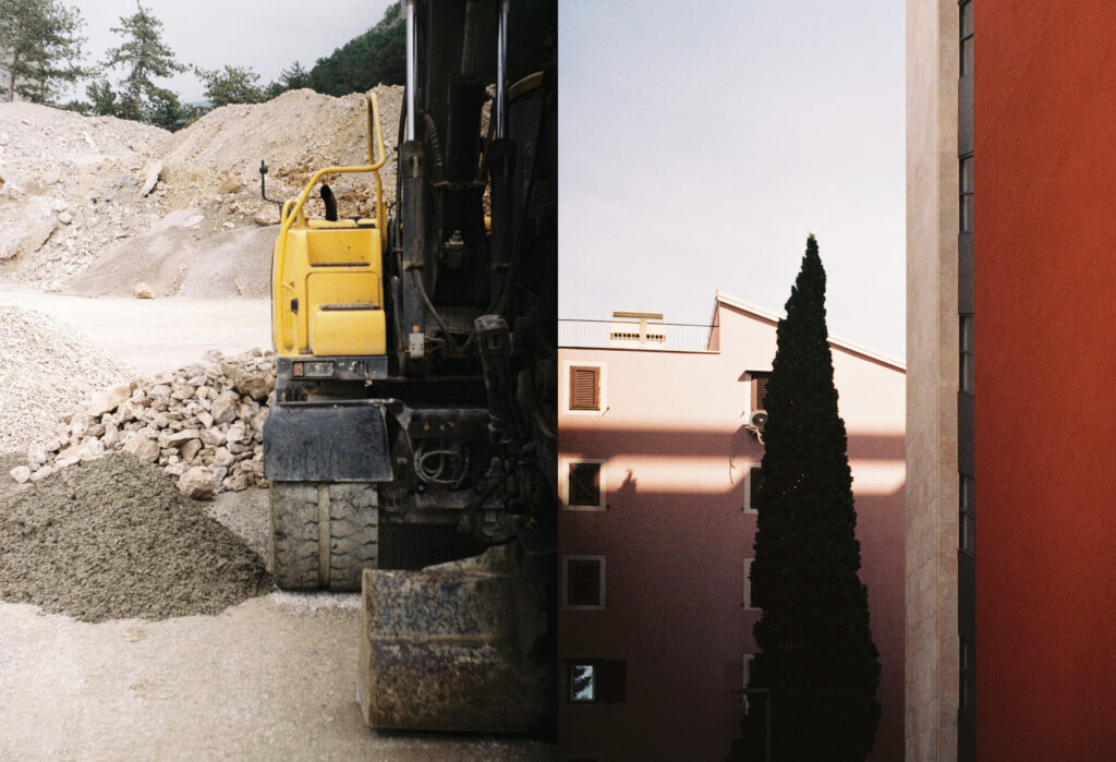
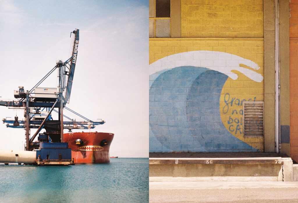
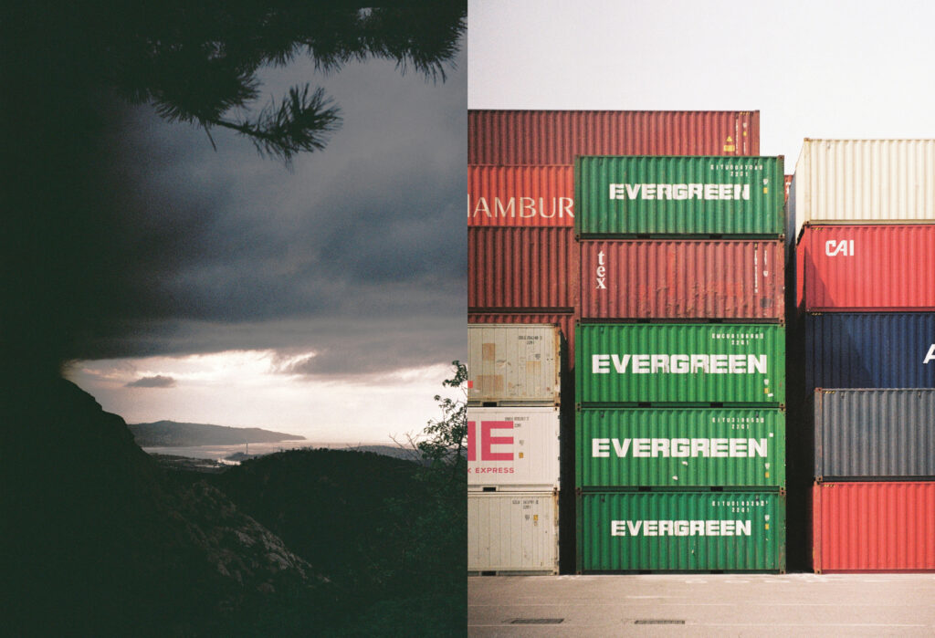
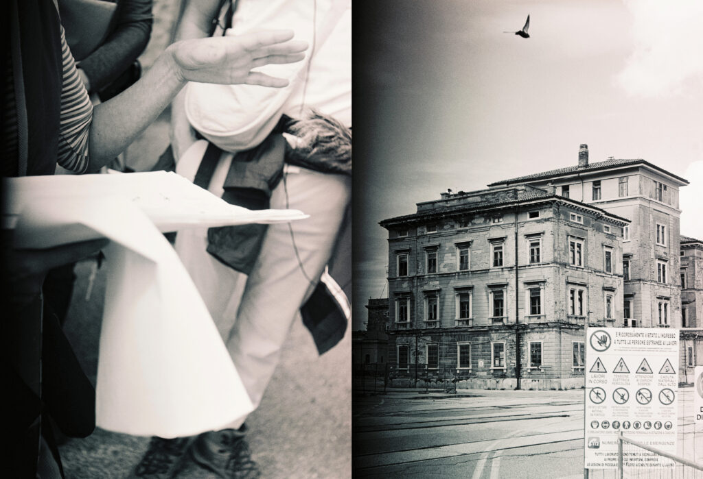
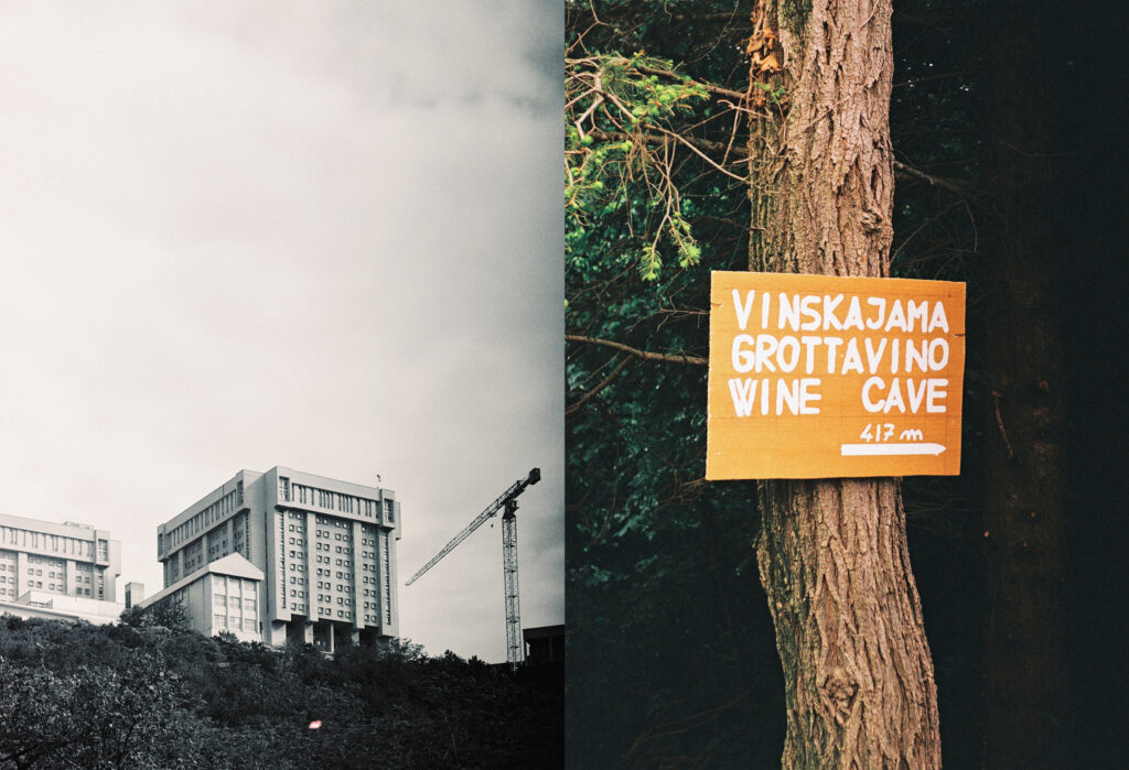
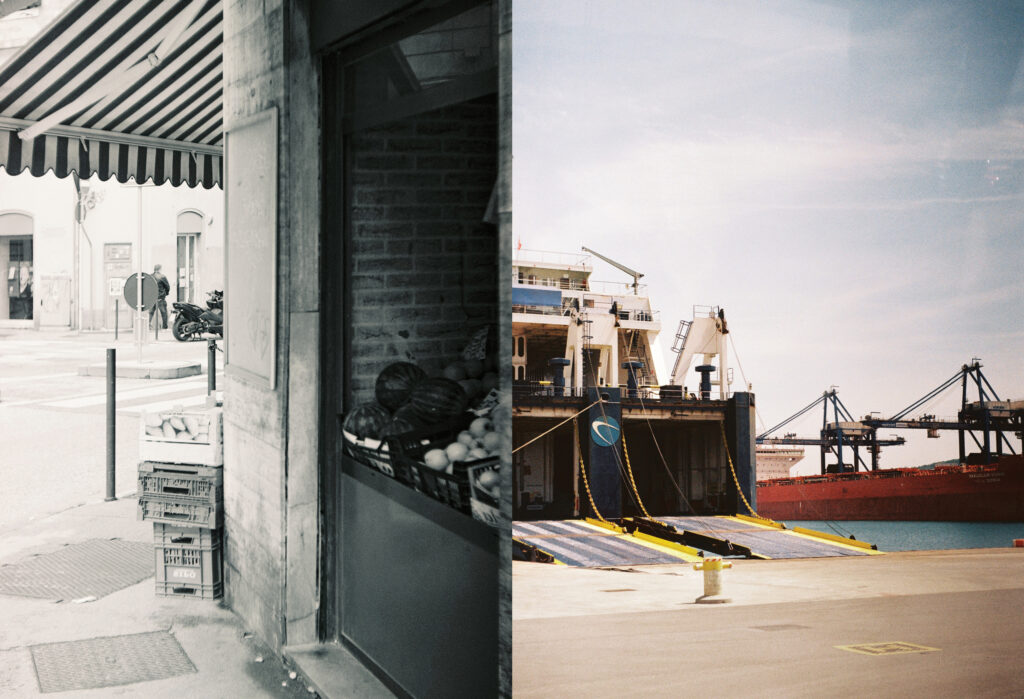
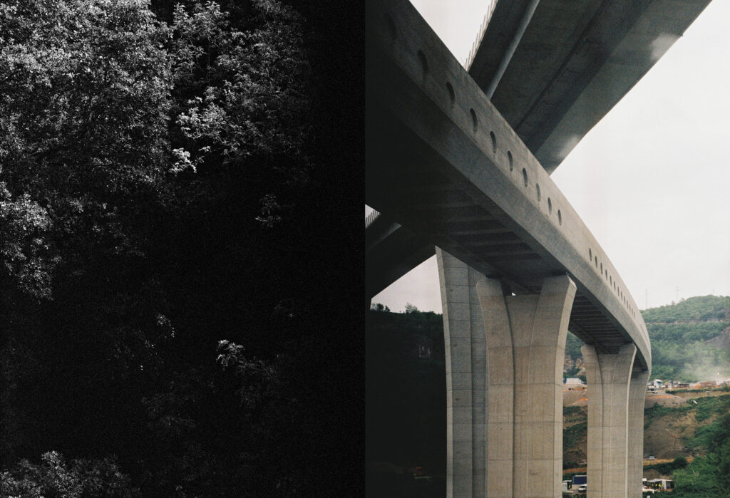
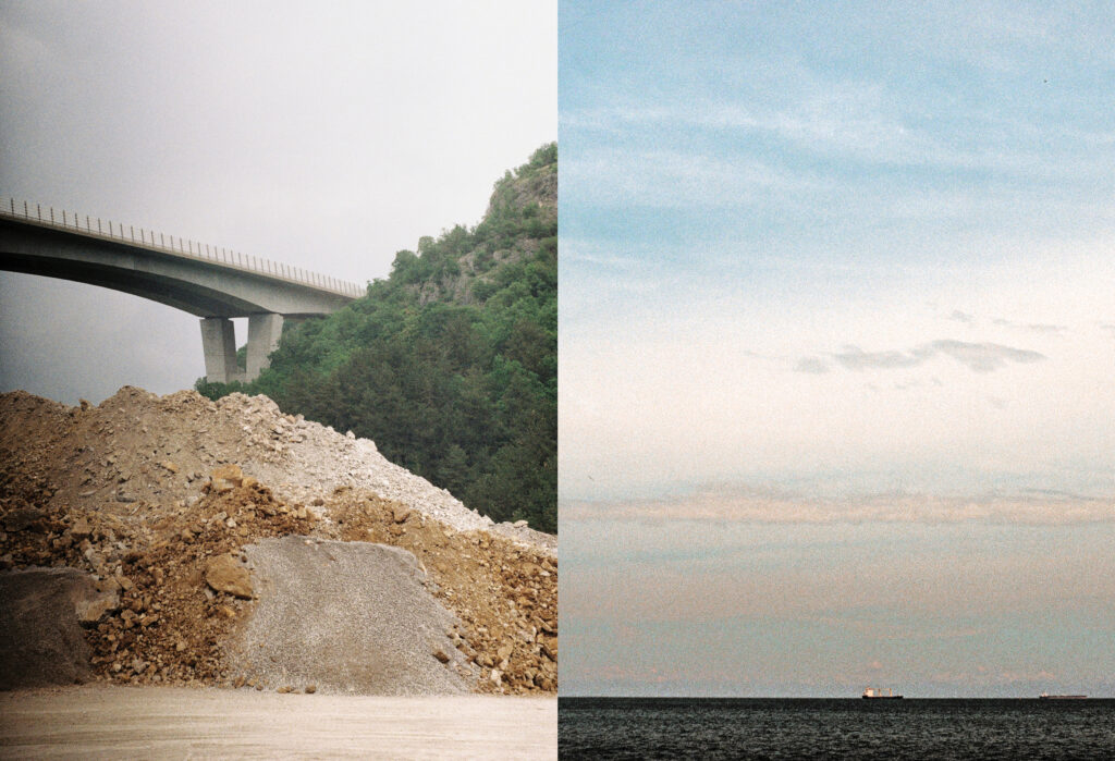
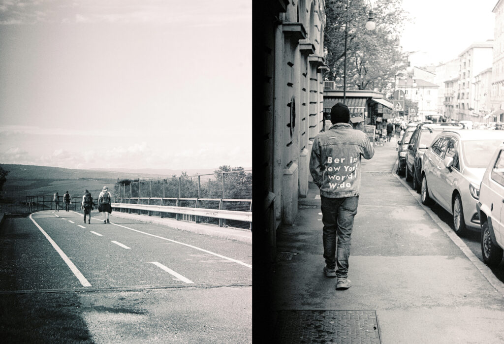
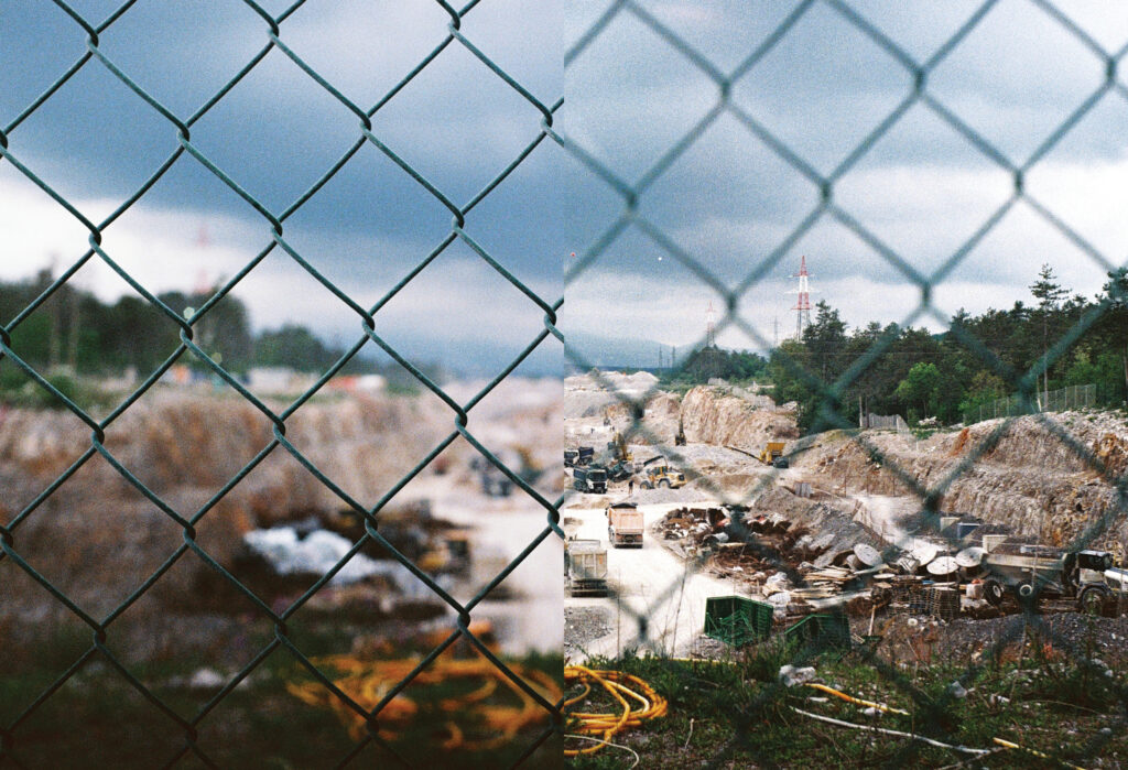
The photographs documenting the walking seminar along the infrastructure routes of Istria were all taken with an analogue camera and are not strictly documentary. Similar to the walking seminar research method, which combines directness with meditative walking and allowing one’s thoughts to wander, I tried to observe and capture on film whatever caught my eye as unencumbered as possible, which does not allow for immediate review of the material – a risky undertaking, but one that frees me from rationalisation, control and conclusions at the moment of creation. The diptychs presented here combine the abstract and the concrete, the total and the miniature, the objective and the intimate. They function as a reportage of feelings, like jumbled notes from the road.
Published June 2025. 2025/7
https://doi.org/10.3986/30240662_07